










NATIVE COMMERCE — POST-PURCHASE EXPERIENCE
Reviews, returns, and the experience after checkout
01 — CONTEXT
Improving the post-purchase experience
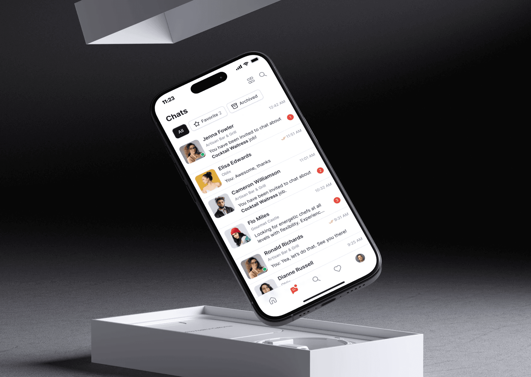
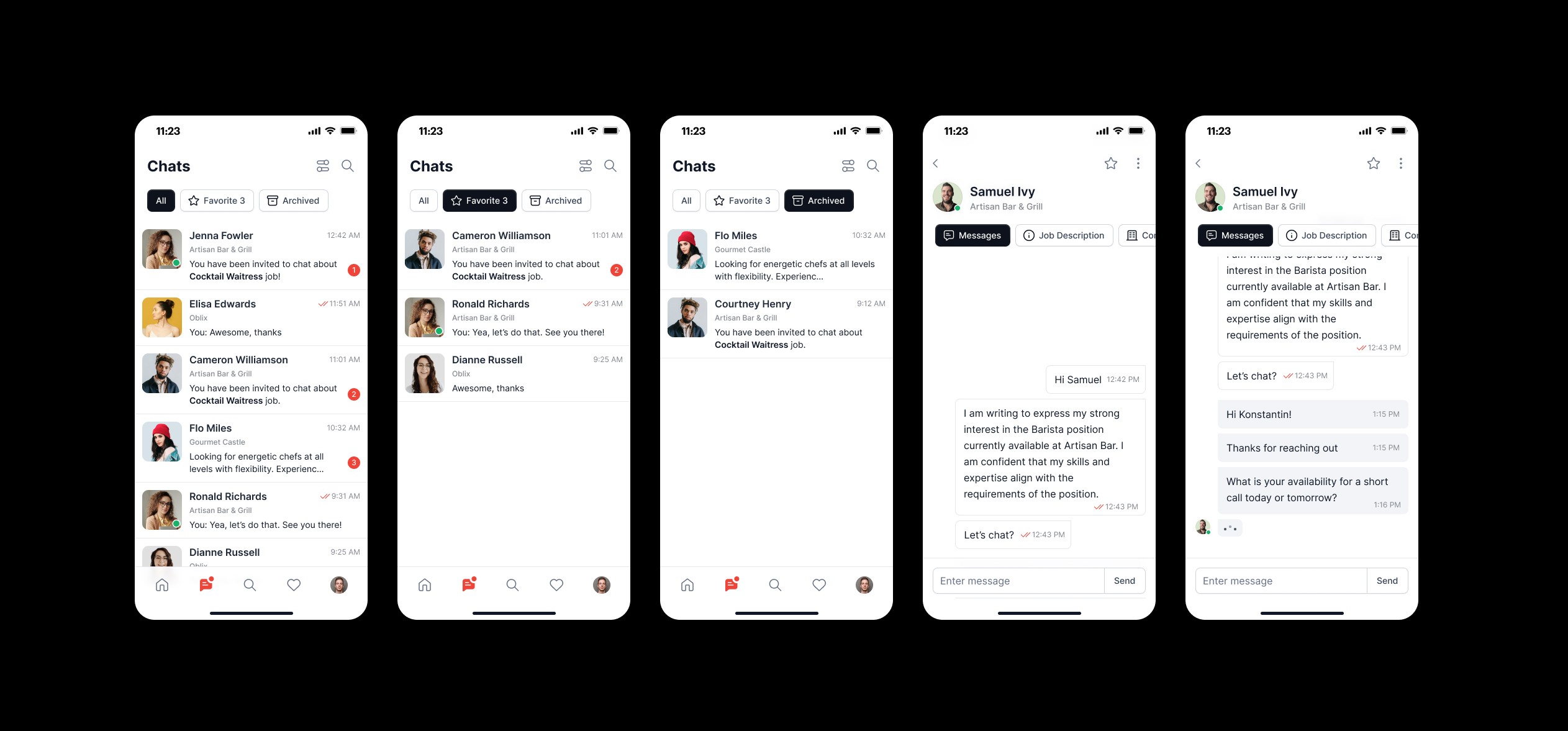
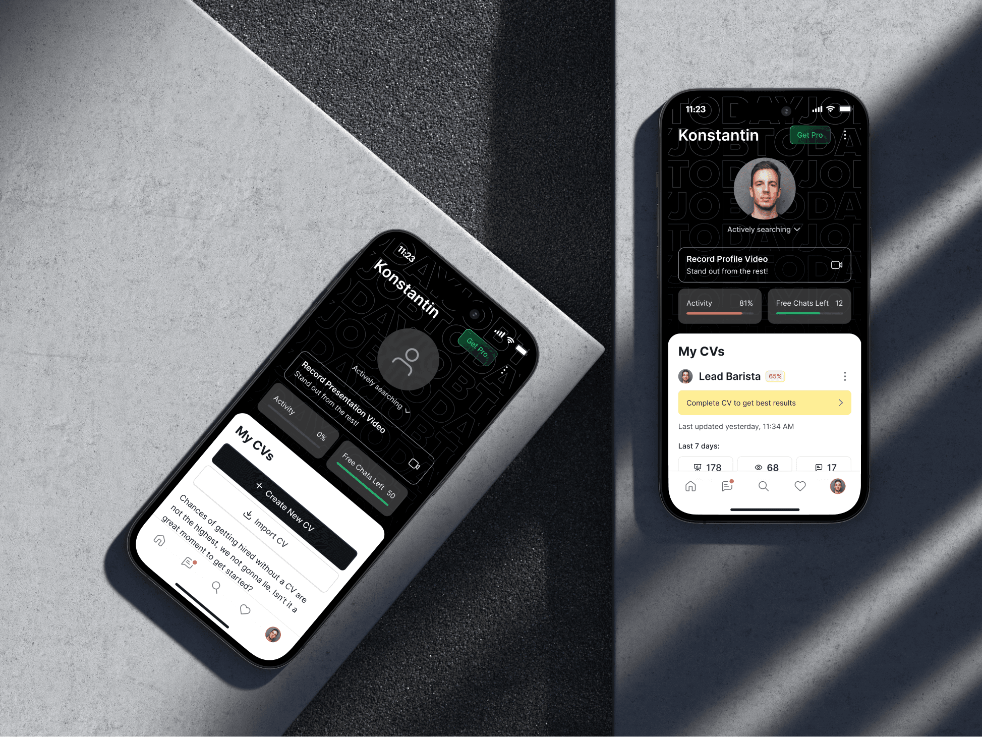
Native Commerce is an e-commerce product where the customer journey does not end at checkout. After receiving a product, customers may want to review it, manage their purchase, or return an item. I worked on two post-purchase experiences: Reviews and Returns. The goal was to make these actions easier to discover, easier to complete, and less dependent on customer support. My role: Discovery — user research and product analysis; UX — user flows, IA and interaction models; UI — final interface and interaction details; Exploration — alternative solutions and trade-offs; Launch — feature discovery and adoption. Discover → Purchase → Receive → Review / Return.
02 — THE PROBLEM
Post-purchase actions were harder to find than they should be
Users wanted to share their experience, but the path to reviewing a specific purchased item was not always obvious. For returns, users needed to understand: Where can I find my purchase? Can I return this item? Where do I need to return it? What happens after I initiate the return? This created unnecessary uncertainty and additional support requests. The opportunity: make post-purchase actions self-explanatory enough that users do not need to contact support to understand what to do next.
03 — RESEARCH
The signal was already visible in support requests
I combined user feedback, support requests, product behavior and competitive research. Recurring questions included: “Where can I find the item I bought?”, “How can I return this item?”, “Where do I need to bring the return?”, and “Can I return this particular product?” These were often discoverability and information problems rather than complex support issues. Reduce support dependency → reduce friction → improve the post-purchase experience.
04 — AUDIENCE & MENTAL MODEL
Users don’t always think in terms of orders
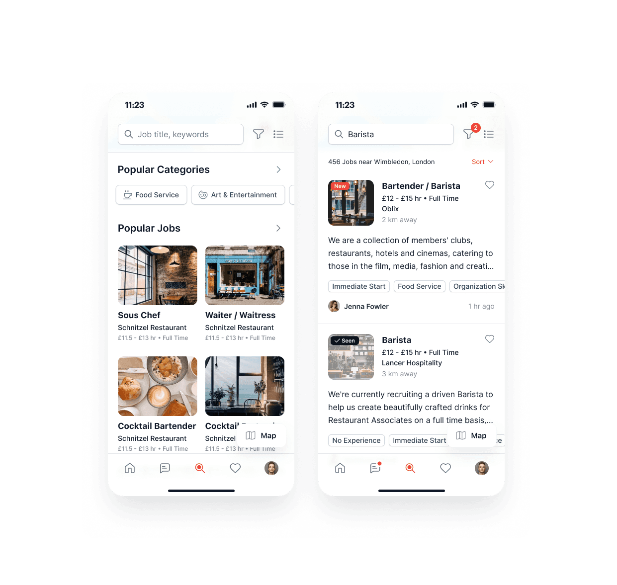
Two mental models emerged. Order-oriented: “I need to do something with the order I just received.” Orders → Order Details → Review / Return. Action-oriented: “I want to review something I bought” or “I want to check my returns.” Reviews / Reviewed Items and Returns / Returned Items. Key insight: users can approach the same functionality from different starting points. This became a main driver of the final information architecture.
05 — PROBLEM → SOLUTION
From discoverability problems to a flexible post-purchase system
Problem: users could have a clear intention — review or return an item — but still need to understand where to start, which item the action applies to, and what happens next. Solution: create contextual and direct entry points. Users can start from Orders List → Order Details when thinking about a purchase, or Reviews / Reviewed Items and Returns / Returned Items when thinking about an action. Different entry points, one consistent experience.
06 — INFORMATION ARCHITECTURE
Supporting both contextual and direct navigation
Order-centric: Orders List → Order Details → Review / Return. Strong context, but users must find the relevant order first. Action-centric: Reviews / Reviewed Items and Returns / Returned Items. More discoverable for action-oriented users. Final architecture: Orders List ↳ Order Details ↳ Review / Return; Reviews / Reviewed Items ↳ Review / manage reviews; Returns / Returned Items ↳ Track / manage returns. The solution was to support both mental models.
07 — REVIEWS
Two entry points, one consistent review flow
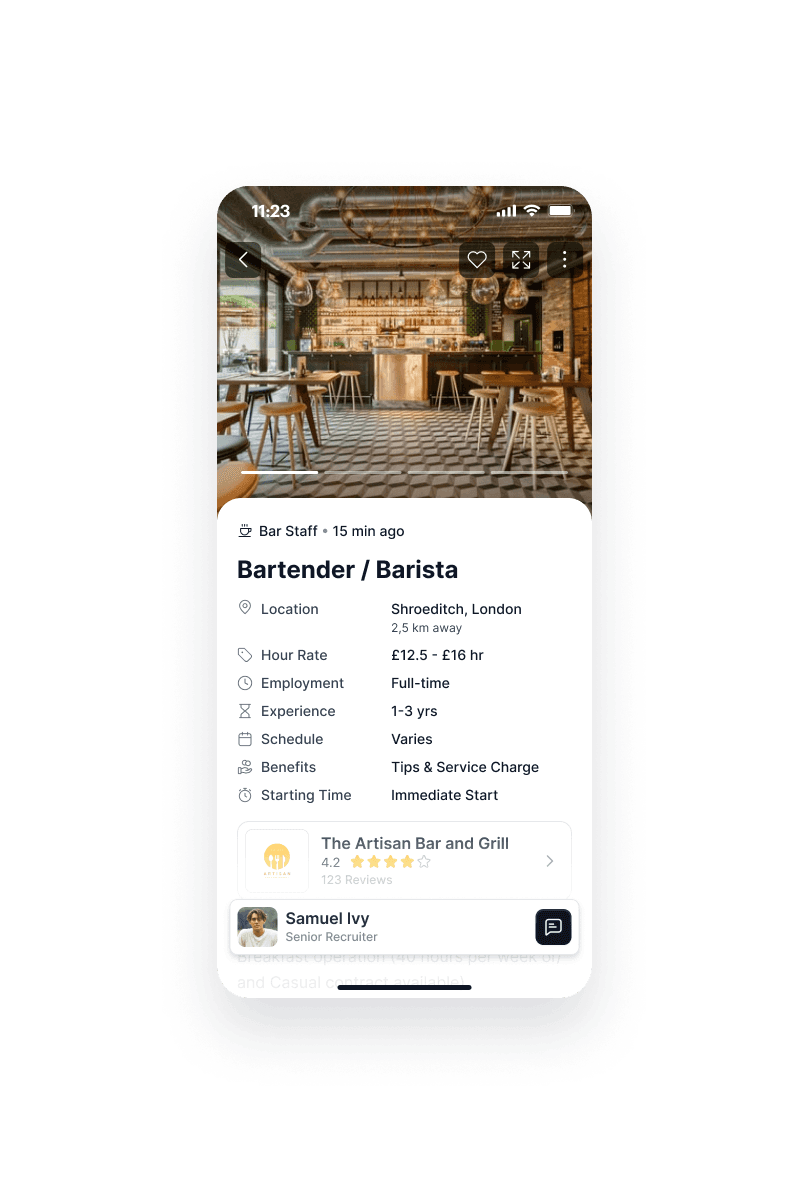
Contextual: Orders List → Order Details → Product → Review. Direct: Reviews / Reviewed Items → Product → Review. Core flow: Select product → Rating → Review → Submit. Principles: keep product context visible, start with the simplest rating step, and avoid making users rediscover the purchased product. Hypothesis: better discoverability + lower friction → more completed reviews → higher review coverage.
08 — SOCIAL PROOF
A review can create value for the next customer
Review discovery ↓ Review completion ↓ Higher review coverage ↓ Stronger social proof ↓ Higher purchase confidence ↓ Potentially higher conversion. A 2024 meta-analysis covering 156 studies found a positive relationship between online review volume and purchase intention. Reviews turn a completed purchase into information that can influence future purchases. Source: Data and Information Management, 2024.
09 — RETURNS
Turning a potentially negative moment into a predictable experience
Entry points: Orders List → Order Details → Return, or Returns / Returned Items → Return details. Core flow: Select item → Reason → Return location → Instructions → Confirmation. Returns could only be made to the original point of purchase or pickup point because of technical and operational limitations. The interface needed to make this restriction impossible to miss.
10 — RETURN LOCATION CONSTRAINT
A technical constraint became a communication problem
The item had to be returned to the same pickup point where the order was collected. The UI makes three things explicit. WHERE — Return to: Pickup Point #123. WHY — This item must be returned to the original pickup point. WHAT NEXT — Bring the item to this location and follow the return instructions. Principle: when a system constraint limits users’ options, explain it at the moment it matters.
11 — RETURNS & SUPPORT IMPACT
The strongest signal: fewer questions reaching support
Before, users asked where to return an item, where to find a purchase, and whether an item was eligible. After, the product answered directly: Order → Item → Eligibility → Return location → Instructions. Illustrative outcome: “Where is my purchase?” tickets −18%; “How do I return?” tickets −14%; “Where do I return?” tickets −21%; return-related support volume −11%. This measures whether the product removes uncertainty, not only whether users complete the flow.
12 — IMPLEMENTATION CHALLENGES
The complexity was not always visible in the UI
Item-level states: Delivered → Reviewable → Reviewed, and Delivered → Return eligible → Return requested → Returned. Eligibility had to be communicated per item, not only per order. Return location was fixed to the original pickup point. The same product could appear across Orders, Order Details, Reviews, and Returns, and its state had to stay consistent. The challenge was keeping the UX simple while the underlying product state became more complex.
13 — LAUNCH & COMMUNICATION
A new feature only creates value if users discover it
Contextual coach marks introduce new entry points: “New: Review your purchases.” First-use guidance provides a short explanation. Relevant push notifications target users with eligible actions: “Your recent purchase is ready for review.” Post-task feedback asks: “How easy was it to complete this?” The principle was contextual, lightweight, dismissible communication rather than generic onboarding.
14 — OUTCOMES
Early impact
Illustrative results: Review initiation +22%; Review completion +18%; Products with 10+ reviews +12%; Return completion +9%; Return-related support −11%; Product conversion +1.4%; Post-task satisfaction +8 pp. Strongest signals: −11% support volume, +12% meaningful review coverage, +8 pp post-purchase satisfaction, and +1.4% conversion. The business impact is intentionally incremental: less friction and support dependency, with better information for future buyers.
15 — REFLECTION
What would I do differently?
01 — Validate the IA earlier: test order-centric, action-centric, and combined models with a larger group. 02 — Measure support deflection from day one: create a dedicated post-purchase ticket taxonomy before launch. 03 — Test return-location communication: validate that users understand where to go and why. 04 — Connect post-purchase metrics to retention: investigate repeat purchase rate and long-term customer value. Biggest takeaway: post-purchase UX is not an isolated set of features. It is a system connecting product information, trust, support efficiency, and future purchase behavior.