Company
Native Commerce
Project
AI Builder
Industry
E-commerce (SaaS)
Year
2026
Role
Senior designer
Team
4 people
Project overview
A seller describes their business in one sentence and gets a working store with catalog, cart and checkout — the AI builder, its landing page, and the platform around them.
“In an AI builder you design the conversation, not the screens.”
Key insight
AI Builder · Native Commerce

My role
I was the senior designer in a team of four. I set the direction and the visual strategy, worked with stakeholders and drew the core flows. The team helped with additional scenarios and states.
01
Me
Direction and visual strategy
Set the direction and the visual strategy for the builder, its landing and the platform.
02
Me
Stakeholders
Worked with stakeholders throughout the project.
03
Me
Core flows
Drew the main flows myself.
04
Team
Scenarios and states
The team helped with additional scenarios and states.
6 weeks
FROM FIRST FLOWS TO A POLISHED INTERFACE
AI in the workflow
AI was built into how we worked. We assembled a large share of the screens and updated the design system with it. That let us draw the core flows, build the mechanics and polish the interface, interactions and micro-animations in a month and a half.
The gap
AI builders give you a page in a minute, but a page is not a shop. Commerce platforms have everything a shop needs, but start with a template and fifty settings.

Research
Before the first screen I put the market on one board: AI builders, their landing pages and store homepages, screen by screen.

Benchmark
17 products end to end, 40 key screens side by side. The top-right corner — fast and deep — was empty. That is the bet.


Onboarding
The journey begins
It starts with one sentence. Three quick questions with answer chips, then a build plan the seller can watch instead of a spinner.


Builder
The builder interface
One screen: the AI chat on the left, the live store on the right. Click any block to edit it in place or ask the AI to change it.

Inspector
Details that do the work
Chat and Page in one panel, a labeled “Edit with AI”, the selection as a chip in the chat, clear statuses, versions and a single Next step.


Canvas
Zoom out and the canvas lays out all six pages side by side — Home, Catalog, Body Care, Product, Cart and Checkout — so a seller checks the whole store in one look, on desktop and on a phone.


Decision 02
The chat is the only panel
Rejected: a designer-tool Layers sheet over the page. Chose: Chat | Page next to the canvas — our sellers are not designers.

Theme
Generic vs. brand
AI output tends to look like a template. Colours and fonts come from the seller’s brand book, and the theme panel pushes it further.


Principle
Simple for a beginner, flexible enough to grow
The hardest balance: an interface a first-time seller understands at a glance, with enough control to make the store their own. We didn’t load the panel with exact section parameters the way Figma or Framer do. Each setting is narrowed to a few clear options, chosen with segmented controls.

Decision 03
The builder lives inside the platform
After the prompt the seller lands in the admin. Sections come alive along their path, and one Next step card in the chat leads to the next one.


Decision 04
Publish today, finish tomorrow
Rejected: instant publish while payments stayed in test mode. Chose: a short checklist where payments are recommended, not required, and clear Draft / Live statuses.

Platform
The store doesn’t end at publish
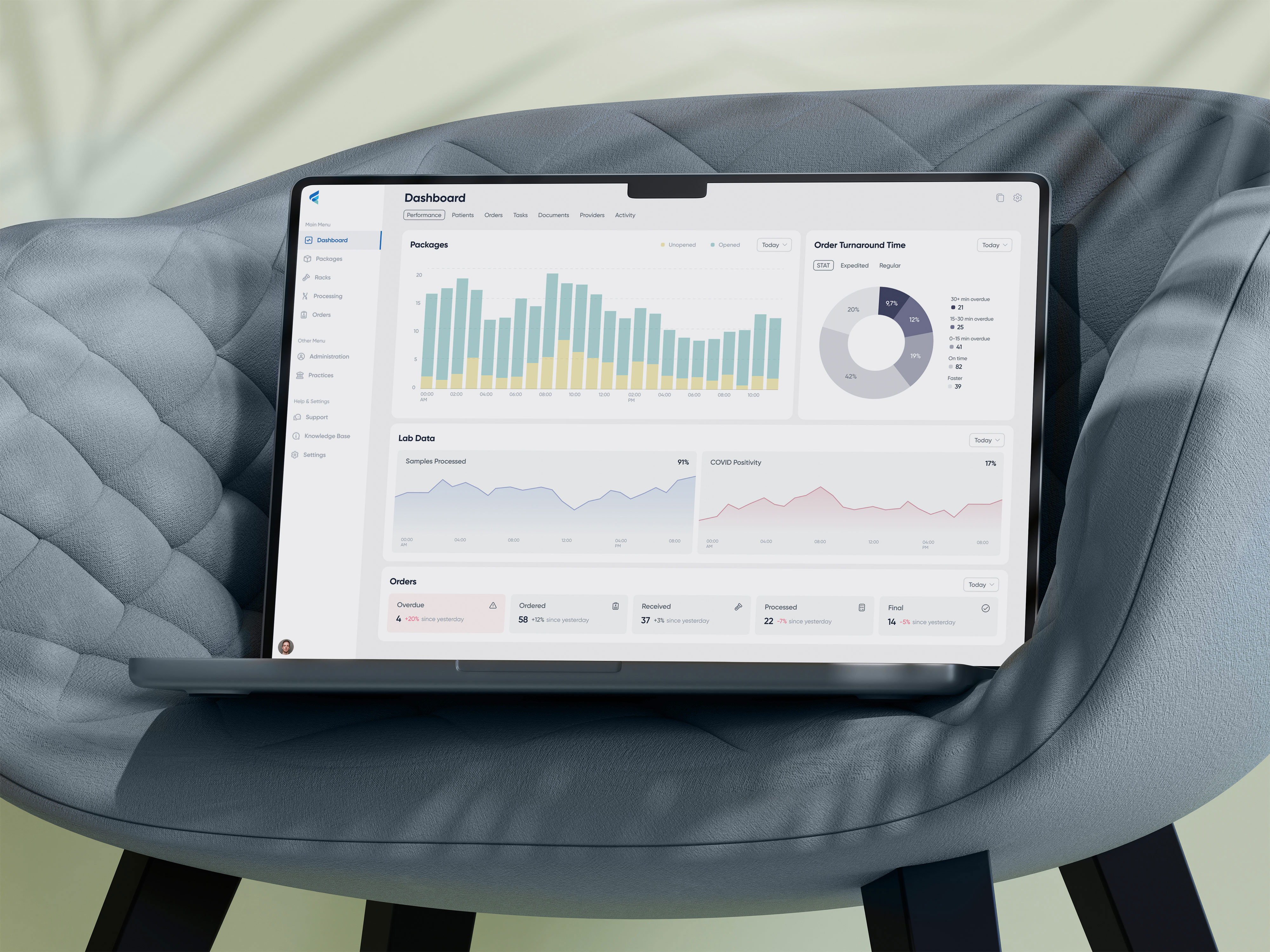
Products, orders and insights were designed together with the builder, so the AI can hand a seller from one to the next.


Exploration
Nine directions for the first screen. Claude scored each one on the same rubric, and I weighed the scores against my own judgement before choosing.
Rubric: how clear the promise is, whether the prompt is the main action, proof of the result, brand character.

Variant 2 vs. Variant 7
Where I disagreed with the score
I rated Variant 2 higher than Claude did. It shows the prompt straight away and the stores right below, a clean alternative.
I hesitated for a long time between it and Variant 7, the direction that shipped.
The landing in the spotlight
The seller’s first step: one promise — describe your business, get a store — with the prompt field right in the hero and real product UI instead of stock photos. The first version ran 11,770 px; v2 halves it to 6,283 px with one proof per claim.

Dark theme
The same landing after dark

The platform around the store

Product thinking
Every decision started with a seller problem, a bet on what it would change, and a number to check the bet against.
Ask, then build
Three question cards with chips, one tap each
Questions inside a chat message got lost: sellers answered one and skipped two.
A complete brief, so the first build already looks like the seller’s store.
Brief completion
Time to first store
The chat is the only panel
Chat | Page next to the canvas
Our sellers are not designers. A Layers sheet over the page reads as a pro tool.
Sellers keep editing instead of getting lost between panels.
Edit-to-publish
Edits per session
A few clear options
Segmented controls instead of exact parameters
Figma-style section parameters overload a first-time seller.
Confident manual edits without breaking the layout.
Manual edit rate
Undo and reset rate
The builder lives inside the platform
One Next step card leads to the next section
A pretty page is not a store. Products, delivery and payments decide the first sale.
Sellers move on from the page to running the shop.
Second-section adoption
Next step click-through
Publish today, finish tomorrow
Checklist, payments recommended, not required
Instant publish with payments in test mode misled sellers; a hard gate would stop them.
More stores go live, and fewer of them without payments.
Publish rate
Payments connected
Four numbers we track after launch
Time to first store
From the first prompt to a store the seller can open. The promise of the product in one number.
Publish rate
Share of built stores that go live. Shows whether the result is good enough to show buyers.
Edit-to-publish
Share of sellers who edit by hand and still publish. Shows whether editing helps or scares.
Second-section adoption
Share of sellers who open products, orders or delivery after the builder. Shows whether it became a shop.